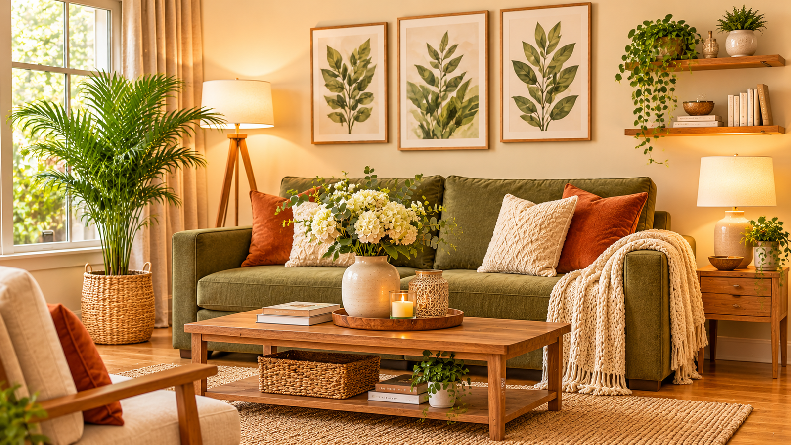
Color sets the emotional tone of a living room faster than almost any piece of furniture. Stark, icy whites can sometimes feel clinical after sunset, while overly heavy colors across every wall may shrink a room visually. The sweet spot for most homes is a warm, modern palette that feels grounded in natural materials.
The 60-30-10 Color Balance
A reliable way to build a living room color scheme without guesswork is the 60-30-10 proportion rule. It gives your eye a clear hierarchy so no single shade competes for attention.
- 60% Dominant Shade: Typically used on walls, large rugs, or the primary sofa—such as warm ivory, soft greige, or muted oatmeal.
- 30% Secondary Shade: Applied to secondary seating, drapery, or cabinetry to add depth—like honey oak, clay, or muted sage.
- 10% Accent Shade: Reserved for cushions, ceramics, artwork, or a single statement chair to bring energy and contrast.
1. Warm Cream, Sage & Natural Oak
This combination feels fresh, calm, and restorative without leaning into cold minimalism. Warm cream walls reflect daylight gently, natural oak adds warmth through grain and texture, and muted sage brings a quiet connection to nature.
Use this palette if your living room gets steady natural light and you want a relaxed atmosphere that works year-round.
2. Soft Greige, Terracotta & Dark Wood
If you like richer contrast, pair a soft beige-gray ("greige") base with earthy terracotta accents and deeper walnut or espresso wood tones. The warmth of terracotta keeps the room cozy, while darker wood anchors lamps, frames, and tables.
Paint large sample boards rather than tiny strips, and move them around the room at 9 AM, 2 PM, and 8 PM to see how undertones shift.
3. Warm Off-White, Sand & Olive
Monochromatic or tonal palettes rely on texture rather than bold hue jumps. Layering warm off-white walls with sandy textiles, woven baskets, and deeper olive cushions creates quiet sophistication that rarely dates.
4. Testing Paint Under Day & Night Light
North-facing rooms often pull cooler and bluer undertones out of paint, while south- or west-facing windows intensify warmth. Always check how your chosen colors look under both daylight and your warm evening lamps or floor lights.
Common Living Room Color Mistakes to Avoid
- Picking paint chips under store lighting: Bright retail fluorescent lights rarely match the light inside your home.
- Ignoring trim and ceiling undertones: Pairing a warm cream wall with a stark blue-white ceiling can make the trim look out of place.
- Adding too many competing accents: Stick to one or two accent tones so cushions, art, and rugs look intentional together.
Building a Palette You Will Enjoy Long-Term
Start with the largest fixed elements you already love—such as a rug, flooring, or sofa—and pull your wall and accent shades from there. A cohesive color story makes even simple furniture feel thoughtfully styled.